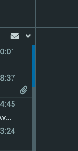
As the title says [and unfortunately impossible to screengrab as it doesn’t capture the cursor] but does anyone else find Roundcube’s scrollbars [between the mail panes] almost impossible to get hold of?
In normal mode, the scrollbar handle is a pretty easy target:

But in dark mode, it’s so thin that, when I hover directly over it, my cursor changes to show I’m moving the divider between the panes. If I want to actually scroll the pane I have to hover just ever-so-slightly off to the left side of the handle until the cursor changes back to a normal arrow and then [if I’m lucky] I can move the scrollbar handle.

A classic case of form over function, methinks!
I think I just end up using the scroll wheel on the mouse or two fingers on my trackpad
I think that maybe that is actually the reason that they can be so thin without too much user complaint. I expect that a majority of people these days use the scroll bars only as a visual guide to where they are in the page rather than something to actually use to navigate, so designers don’t worry too much about their usability. Annoying for the people who do want to use them though.
@stuzbot I’m sure it wouldn’t be hard to override the scrollbar css somewhere in the Roundcube template files if you wanted to make them wider.
You’re probably right. I never noticed the problem until I used it on my desktop machine [an old Imac, which has a mouse without a scrollwheel]. On my laptop I just 2-finger scroll with the trackpad.
Good idea. Once the dust has settled I’m planning to tweak the webmail landing page anyway, to make it fit with my website better. I always like to make sure I have another rabbit hole to dive down lined up ahead of me, at all times.
Just remember whatever tweaks you end up making will be overwritten during the next upgrade of MiaB. It’s best to keep track of them backup files, etc.

